Hospitality of a Homepage
/tl;dr
Where our wayfinding was familliar and efficient, we wanted our homepage to be the sweet to its salty, its perfect balance. A place to get lost in exploration, discover something new and be inspired.
the team: Ashley Tenn, UX Researcher; Kate Tetreault, Director of Product Design; Abi Solberg, Design Director; John Torres, Creative Director

/goals
Affirm a visitor's curiosity by baking learning moments right into the page; encourage exploration whether they’re a first time visitor or long-time friend.
Capture the truly unique feeling of being welcomed into the Test Kitchen itself, jumping from discovery to discovery and seeing what we’re excited about.
Simplify the experience, making it extremely clear and immersive.
Communicate how, in a crowded food media landscape, our brands rally to uniquely support home cooks, focusing on the ‘why’ over the ‘what’.
/the
opportunity
For purveyors of strong, science-based storytelling and instruction, our homepage was offering home cooks an incongruously chaotic, fractured, and stingy experience. Users found it difficult to choose what felt interesting enough to explore. We were doing a better job telling them who we are than we were showing them why who we are can help them.
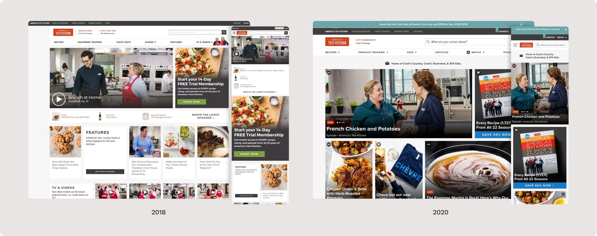
We attempted a cleanup in 2020, but found that users were still overwhelmed and under-impressed by the page. This led us to rethink our homepage entirely, which was really exciting!
Baseline tests were undeniably clear– 2020’s hard-won nudge in the direction of simplicity and clarity was not enough. In an effort to pack in as much depth and breadth as pixels would allow, we’d communicated volume but not value nor voice. Encouragingly, we learned that our users love the corners where we show intentional curation with editorial voice, and wanted more of it! We were moving in the right direction, but needed to cover more ground.
I see a lot of things here that I can buy, but I can’t figure out how to explore things that benefit me… I only get a very brief taste, which isn’t enough.”
“
“
There are other options that don’t feel as overwhelming.”
“
If this wasn’t a test, I would have already closed the tab”
/the
odyssey
Our redesigned homepage offers something new to each visitor, multiple times a day. We created a new discovery-forward card for our design system, highlighting more of the magic and allowing people to get excited about the why before clicking in. Like the social platforms we know our users do most of their content discovery on, ours was frequently updated, story-forward, and snackable.
We also wanted to celebrate and honor a member's journey with us, so we built it right into the page. Highlighting recent searches, saves and custom curated collections for them; personalizing their homepage beyond their logged in icon.
See for yourself– get lost in the prototype scroll!
/the
outcome
During unmoderated prototype testing, prospects got cozy in the flow, picking up on the micro and macro ways we could support their cooking journey–
“
This isn’t only about recipes, it’s about…making the difference between being good and being great”
“
I feel like I’d be able to really learn new things here!”
This goes beyond recipes, this is about the ART of creating a meal… about optimizing yourself to be a better cook; it’s about how to improve yourself!”
“
Since relaunch, we’ve also seen an uptick in folks saving content from the homepage, leading us to believe that the experience’s generosity and simplicity are changing hearts and minds.
This project was the first bite of a major digital product rethink– moving from a dense catalog to a relationship built on shared values of simplicity, the joy of learning and nerdiness. We’ve been working to extend these patterns into the rest of the site experience.
/coda
/more 👀
01
02
03
04
05
06
07
08