Mise (UI) En Place
/tl;dr
Single-use components and mounting tech debt made for a fractured product ecosystem and blocked our team’s ability to do meaningful, iterative work. So, we created Mise UI: ATK’s first design system of repeatable, accessible components.
the team: Ashley Tenn, UX Research; Taylor Gonzales, UX Designer; Alexandra Boeri, AJ Estrada, Bradford Rusick, and Daniella Barrera, Olivia Sheldon, Product Designers; Kate Tetreault, director of Product Design; Abigail Solberg, Design Director; John Torres, Creative Director.

/goals
Create single source of truth for UI style, behavior, language and use across brands, content types, user states
Optimize the process for creating new prototypes and experiences with product and development partners
Ensure an accessible, consistent site experience– especially for disabled users
Speed up the time necessary for iterations and testing
/the
opportunity
The America’s Test Kitchen brand & business has *a lot* of moving parts. First and foremost, ATK isn’t just one brand– it’s three (or more!) brands under one umbrella. Take those three brands, multiple business lines and content offerings, and multiply by a decade or so of online presence: you’ve got a fractured, inconsistent and often inaccessible experience. Not only do those inconsistencies contribute to increased cognitive load for our users, it’s an inaccurate representation of some of the core aspects of the ATK identity (meticulous, transparent, best-in-class).
We’d created a static pattern library and style guide in the past, but these documents weren’t permeating the broader team’s routine. Design, dev and QA weren’t working off of the same source of truth, and it bogged us down in different code bases, tech debt, and communication challenges. With aggressive company growth goals on the horizon, we knew something big needed to change.
Mise en place, a commonly used French phrase in kitchen’s across the globe, literally means to “put in place.” In kitchens this refers to gathering, measuring and preparing all your ingredients and tools before starting to cook. This makes the cooking process itself less stressful, and allows for you to act quickly and enjoy the cooking process. We thought this was a perfect metaphor when starting to work on our design system.
/the
odyssey
We assembled a small cross-functional group of UX, Design, Development and Product partners. To create a tool that solved cross-functional problems and had cross-functional users, we needed to involve them in the process. It was also important to us that the new system was equitable from the ground up, so we worked closely with the amazing folks at Perkins Access to ensure that disabled home cooks’ specific needs were being met.
Mise 1.0 was, by necessity, complex– it had to work hard! Components not only needed to accommodate 10+ content types and 5+ user states but they also needed to flex to fit within each of our three brand environments. We created toggleable “themes” for America’s Test Kitchen, Cook’s Illustrated, and Cook’s Country; recognizing that brand voice comes from the content itself, we designed our components to elevate our brands’ photography and editorial– not distract from it.
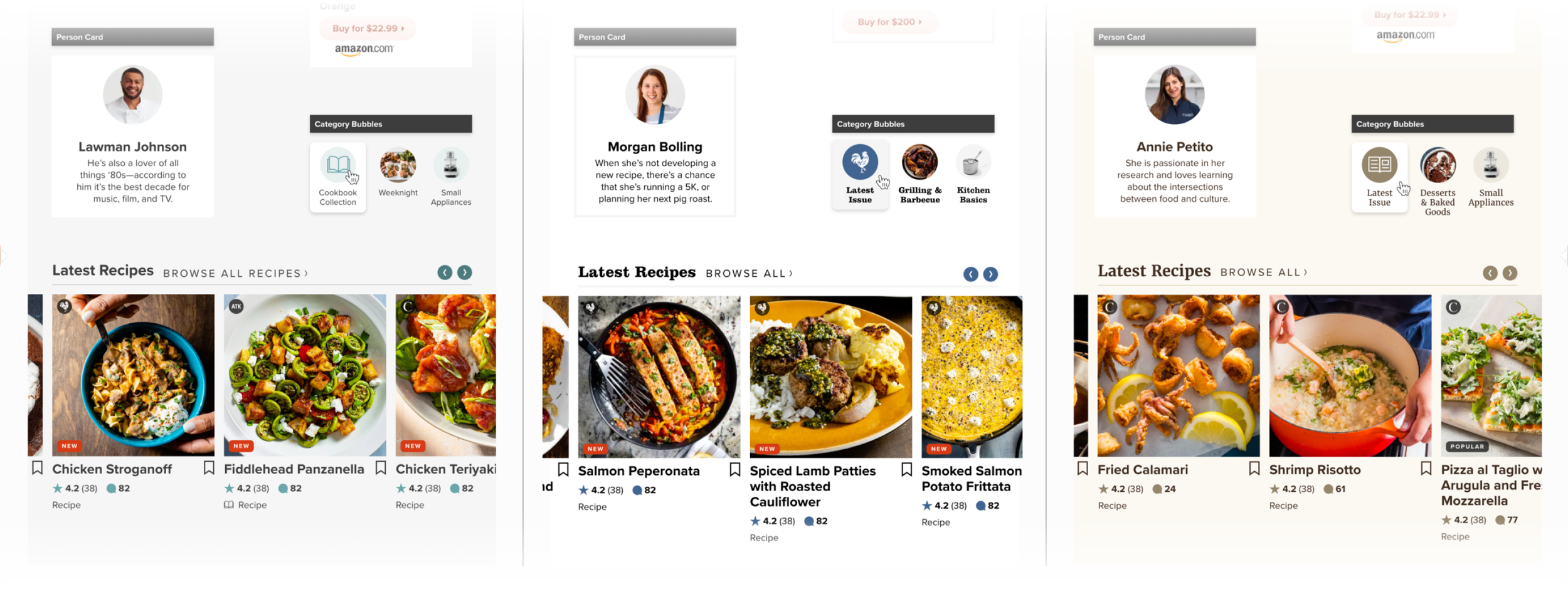
Mise 1.0, a shapeshifting powerhouse
After a year or two of consistent incremental improvement, a big strategic sea change ushered us into a significant overhaul– we were moving to a consolidated parent brand experience. The decision was hard won, and the result of compelling user research, cross-team collaboration, a renewed focus on our company mission and goals for the future. Consolidation would bring clarity and ease behind the scenes, and, more importantly, to customers.
We opted to bundle the move from XD to Figma along with the creation of Supermise. The journey was steep, but folks learned by doing, and, most importantly, by doing together. Supermise creation and documentation was a team effort– our UX researcher added in context about how specific components served home cook, and UX’ers about accessibility and strategic use guidelines.

A slice of Mise 2.0, or ‘Supermise’
Supermise now supports the core site and app experiences– home, discovery, and storytelling content. We’re planning to add two new themes for UX’ers: low and medium fidelity for wireframing.
We also partnered with our developers to pair our figma style guide to one in Storybook– increasing the visibility and understanding of Supermise for our product, editorial, and marketing partners. We’re hoping it will serve as a helpful onboarding resource for new ATK’ers, too.
We are still working towards complete design system coverage across all corners of our ecosystem. Thus far, we’re incredibly encouraged by Mise UI’s impact on both our internal teams and our community of home cooks:
Increase in speed of design time and stakeholder approval process
Decrease in amount of QA time required
Greater sense of shared ownership of UX/UI with developer partners
Streamlined iteration on components when we release a new feature
Continuously improve our site and code to meet accessibility concerns (see this Boston Globe article!)
The supermise library is a great tool to refer to when new features are being developed because QA is able to refer to it to get the information needed if we're uncertain. Every component, font, font size, color, and more is there for us to reference!”
“
–QA Manager
/more 👀
01
02
03
04
05
06
07
08