Reviewing Reviews
/tl;dr
creating more space for what comes before (and after) “which one to buy” in the ingredient & equipment journey
the team: Kate Tetreault, Director of Product Design; Abi Solberg, Design Director; and Tabitha Rodrigue, Design Director; John Torres, Creative Director
/goals
Reduce the cognitive load and clicks required to get a both cumulative & scannable education around specific kitchen ingredients and equipment
Help support home cooks in more points in their journey than just the one that generates affiliate revenue
Support aggressive affiliate revenue goals while keeping focus on The Learning and keeping Spammy Vibes at bay
/the
opportunity
As we looked at ways to reduce cognitive load and increase clarity and joy within the Reviews domain, the theme of more integrated storytelling was one that came up again and again. For a combo plate of legacy-related reasons, Review's content was split up across the board. A product’s in-depth chart of purchase recommendations was on a totally different page from the robust and compelling storytelling that revealed its unique testing process. To discover the full story of why we preferred one slow cooker over another, someone in the market for that item needed to bounce from page to page to discover the answer. This fragmented and transactional approach was underserving both our wildly curious users *and* our Reviews Team.
We also found that by only offering one option to purchase our recommendations, we weren’t only leaving revenue on the table, but also making our members do the work of searching for the best prices, availability or shopping preferences. This approach also aligns with our editorial perspective: make a recommendation, but ‘show the math’ so our smart and curious home cooks can make the best decisions for themselves.

the old reviews experience was fractured, leaving the most meaningful parts of the testing story hidden and of the product discovery journey unsupported
/the
odyssey
A new detail page brings all knowledge we have around a product (testing process, buying recommendations, how to’s, recipes to make, other related products) together in one place; it gives users the structure to explore in a light or a deep way over repeat visits, and editors the option to flex the template to best tell the stories that need telling. The migration and integration of article content also gave us the opportunity for a meaningful expansion of Mise UI, our design system. We worked closely with Dev and Editorial to audit the legacy CMS and determine what components existed, needed to be maintained, or needed to be created.
We adapted our reviewable cards to fit into the new design system, and also including a buy button drop down. Rather than stacking many buttons, distracting from the why we preferred that item, we opted for a dropdown when more than one option is available. Allowing the user to choose when they wanted to compare the stores and prices. If there is only one buying option, that dropdown simply becomes the button that takes you there.
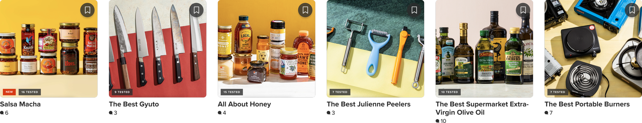
The redesigned web experience for Reviews

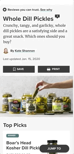
The redesigned experience for iOS
/coda
We’re excited to bring more personalization to reviews, and to create an experience where the page evolves as your relationship with the product/category does– the experience should flex to support someone who’s new to Immersion Cookers as well as someone who’s a pro looking to be challenged. Can we remember your buying preferences– by lowest price, by store, etc? Can we build a virtual inventory of the pieces you rely on the most, and globally cater your content experience that landscape?
/more 👀
01
02
03
04
05
06
07
08