Wayfinding & Discovery
/tl;dr
That perfect recipe is only perfect if you can find it. We redesigned our wayfinding to help you find what you need when you need it–even if you’re not sure what you’re looking for, yet.
the team: Ashley Tenn, UX Researcher; Kate Tetreault, Director of Product Design; Abi Solberg; Taylor Gonzales, UX Designer, Associate Design Director.; John Torres, Creative Director
/goals
Increase retention by creating a space that’s comfortable, curiosity-piquing, and familliar to new and older faces
Develop a deep understanding of the core content questing models– and build a system that flexes for all of them
Build a playful and forgiving system; one that that rewards exploration instead of punishing it
Unify UI across search and browse, given the ultimate goal for both is to connect you with what you need
Interrogate and scrub the ‘inside baseball’ IA, language, patterns derived from internal org structure and legacy paradigms
Making content discovery that acts like good transport– reliable, fast, comfortable, accessible, convenient, affordable, and safe
/the
opportunity
While Test Kitchen brand storytelling crows that ‘we do the work so home cooks don’t have to,’ that promise wasn’t ringing true in our product experience. Long-time members devised personal work-arounds to ‘hack’ an inconsistent and infuriatingly brittle system, while newer users glazed over at the ‘inside baseball language’ and ejected. The map was cryptic and unforgiving in the most crucial routes: header, footer, mega menus, searching and browsing interactions, related content, etc.
Our magazine-first legacy has led to multiple websites for our brands, all with slightly different menus and tags; as well as a tone that leaves users feeling like we are only here to help with “big, project recipes” when we have so much more to offer those with different time, space or dietary constraints. Our vision was a playful, flexible, satisfying system that facilitated learning moments big and small, and kept pace with users.
/the
odyssey
In order to re-magnetize the experience around the home cook, we needed more context– to go beyond a/b and concept tests. Our amazing UX Researcher Ashley Tenn, was in their ELEMENT! They waded deep into our home cook community to observe, synthesize, and share insights not only about the logistics, rhythms, and goals of the content discovery process– but also it fit into the larger ecosystem of their daily lives and values.

Big shout outs to co-design panel power-users, Robynne and Deb, pictured above <3
Ashley’s approach was multi-modal: pattern research / competitive analysis, moderated discovery sessions with our co-design panel, exploratory posts in our co-design panel, unmoderated discovery sessions with prospects for both baseline experience and for prototypes.
They gave the team some juicy themes to explore, including ATK’s Sense of Self, Anticipation & Forgiveness, Immersion & Wiggle Room, and Sensory Exploration asking:
Can we take more meaningful ownership of our changing brand identity?
Can we find impactful and creative ways to respond to people’s varied needs?
Can we help people get into a flow state without backing them into corners?
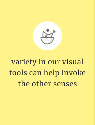
Can we bring more of the sensory world into our digital landscape?
A snippet of their insight pack is shared below–


Interested in a deeper look at Ashley’s research? Head over to their site!
We also tackled empathy-building within our cross-functional internal team– many of whom had been working inside The Broken System for over a decade. Ashley and I collaborated to design and leading a Dungeons & Dragons style role-play workshop with each of their newly identified ‘Quest Types.’ It was a joy in every sense.


Ashley’s magnetic and playful facilitation style really helped all participants get into character as we synchronously collaborated in a google slides deck. They ran the workshop with both product and editorial leadership, to transformative effect. Here’s a few of the moments of customer solidarity that they elicited from attendees–
Curious about the ‘quest modes’? check out the "Connecting Dots” story

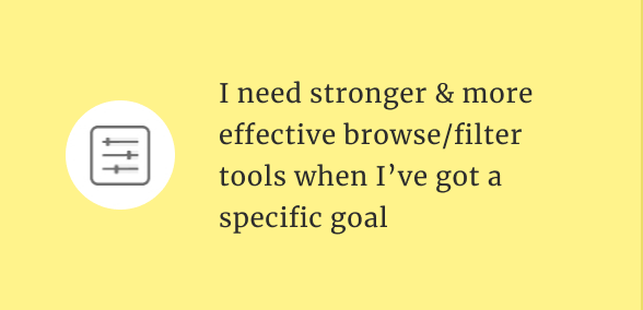


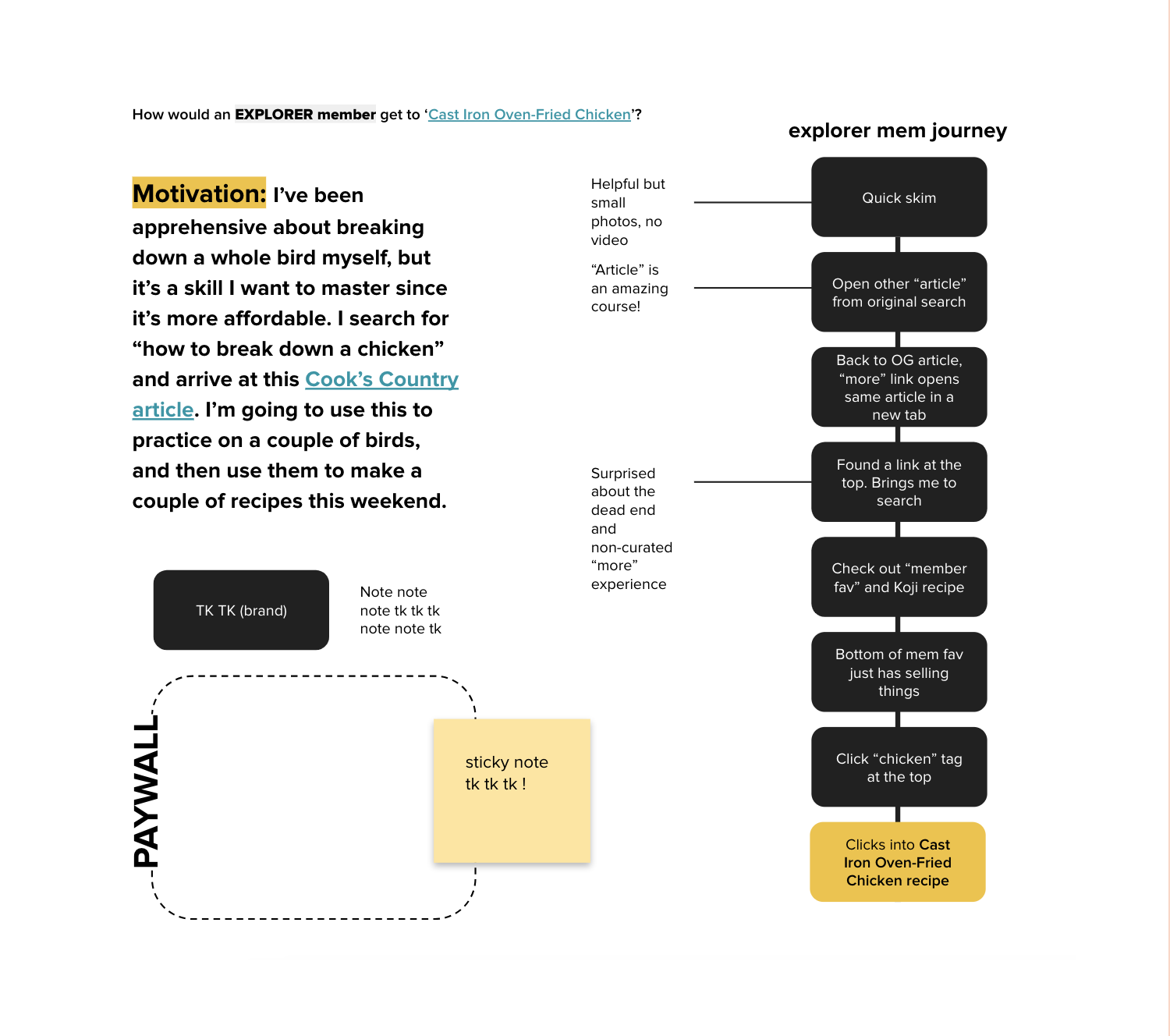
One crucial reframe the research gave us was that search wasn’t the most popular user flow in the product because it Was So Great or because 99% of folks were speedrunners, but because it yielded the most manual control to users looking to get around a loud, overwhelming and unhelpful system. Browsing, and its underlying infrastructure, needed a hard reset.
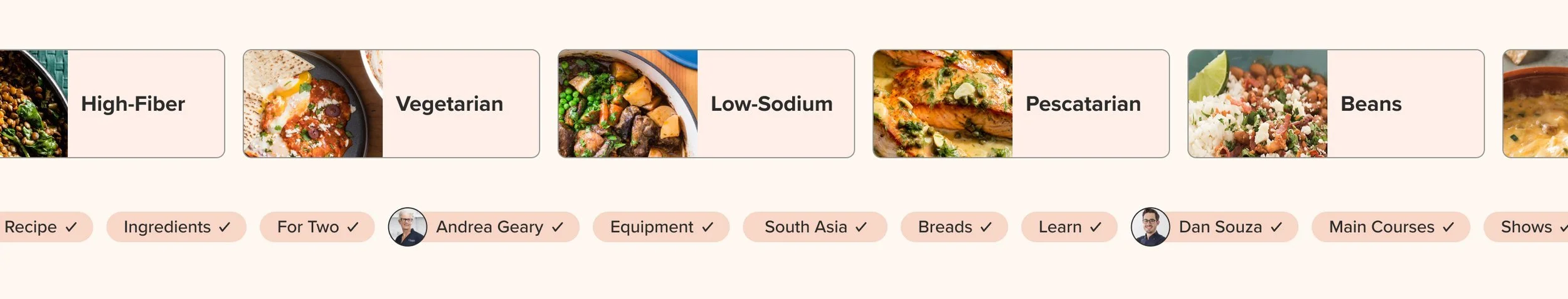
We simplified our top level nav in both quantity and clarity of CTAs– making more room to scan the most meaningful landmarks and wayfinding cues. The header now highlights key actions and topics, centralized and flanked by our brand & customer’s shared mission.
Mega-menus show only high-value and seasonal categories to help home cooks get their bearings without a taxing cognitive load. We gave more TLC to the earlier parts of the search journey, adding a more visual type ahead with recipe previews and a small set of optional filters. In addition to extending the access/visibility of filters, we also tackled their hierarchy– prioritizing customer-centric filters like ‘gluten-free’ ‘for two’ ‘make-ahead’ ‘Southeast Asian,’ etc that reflect folks’ searching anchors, rather than internal Test Kitchen categorization.
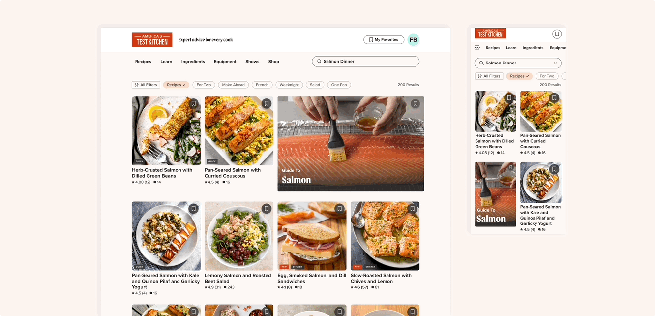
New discovery tools are elastic, playful, and responsive

New footer frames a long-complex brand story in a user-centric way, and turns a link farm into a cleaner and more purposeful set of actions
Through more natural language, a visual system that unifies searching and browsing and a simplified mega nav, our new wayfinding helps customers expend less energy on ‘getting there’ and more on exploration and enjoying the journey.
This is currently in a split beta, but we’re seeing great early indicators, including an increase in retention!
/coda
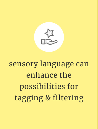
During discovery, we tested sensory filters like ‘crispy’ ‘velvety’ ‘comforting’ ‘refreshing’ ‘rich’ to great result– mapping this new set of tags to our 25 year deep collection is no small feat, but we’re eagerly (impatiently) anticipating it.
Researched also revealed the imperative to decode and unbundle one-size-fits-all language like ‘weeknight’ into more specific and accurate needs, e.g. ‘makes great leftovers’ ‘hands-off’ ‘freezes well’ ‘pantry staples’ ‘easily gluten-free’ ‘under 30 minutes’ etc.
Also, given how journeys can span device types (recipe-hunting on ipad while watching The Bachelor to cooking from your phone in your messy kitchen) we’re also eager to bring forward more of the ‘pick up where you left off’ features we’ve already implemented in our mobile app. Continuity is crucial in creating flow, and there’s more work for us to do there.
/more 👀
01
02
03
04
05
06
07
08